Get Your Envelopes Opened With These Attention Grabbing Tactics!
By Paul Bobnak | August 8, 2019
Editor’s Note: This post was originally published in August 2019 and has been updated for accuracy and comprehensiveness as of October 2022.
Your envelope’s basic job is delivery – but not just physically delivering its contents to your target audience. It also delivers your first marketing message.
This isn’t the same as using the envelope to sell directly. Your envelope isn’t supposed to sell, although some try with a call to action or even a QR code that tells the recipient to skip whatever’s inside.
The envelope should grab your customer’s attention as soon as they see it in their mailboxes.
It must engage them on a visual or other sensory level and then get itself opened. That can happen right away, or it can be put in a “to be opened” stack for later review – whether 5 minutes or 5 hours later.
The paper and ink you use, along with the copy, images, graphics, or embellishments on the envelope, should help it stand out from what your recipients usually see while supporting your brand and the message inside.
What makes an envelope stand out
Your envelopes have 3 seconds – maybe – to grab your customer’s attention and pique their curiosity so they open instead of discard them.
It’s a tall order, but you have plenty of tools to make your envelopes open-worthy.
Size: It seems like everyone mails a #10 envelope for Marketing Mail and transpromo (bills and statements) mailed First Class. So, look at other sizes. Note: Because of USPS’s processing equipment, switching to an unusual size might change your postage rates. Consult the Postal Service – or check with the envelope experts at mailing.com – first.
Weight: Although rising postal rates make might make this option more difficult to justify, an envelope with heft from several heavier enclosures is more intriguing than a flat #10.
Check out these examples we pulled together of some of your choices:
Shape-Cut: This option gives you a way to create a stand-out envelope – a customized shape that appears on the edge of the envelope between its top and bottom edges. Be sure to get USPS approval before sending this nonstandard piece.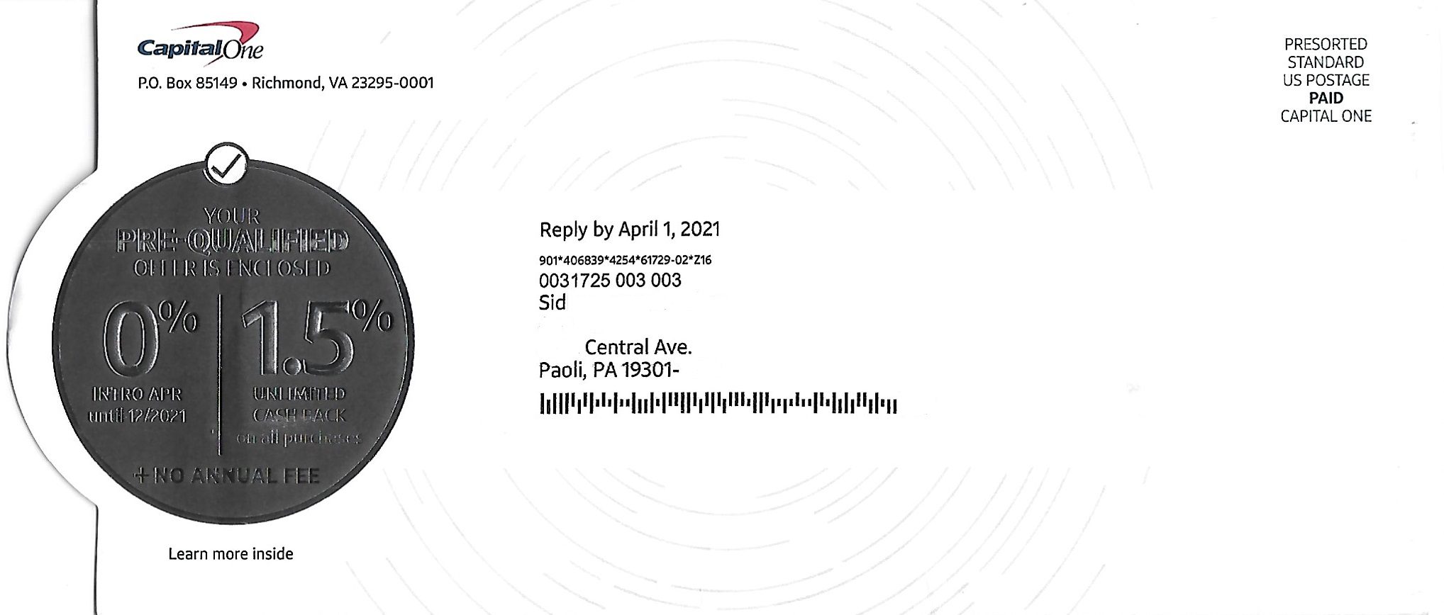
Poly letter-size envelope: This format allows your recipient to see more of your mailer’s contents before opening.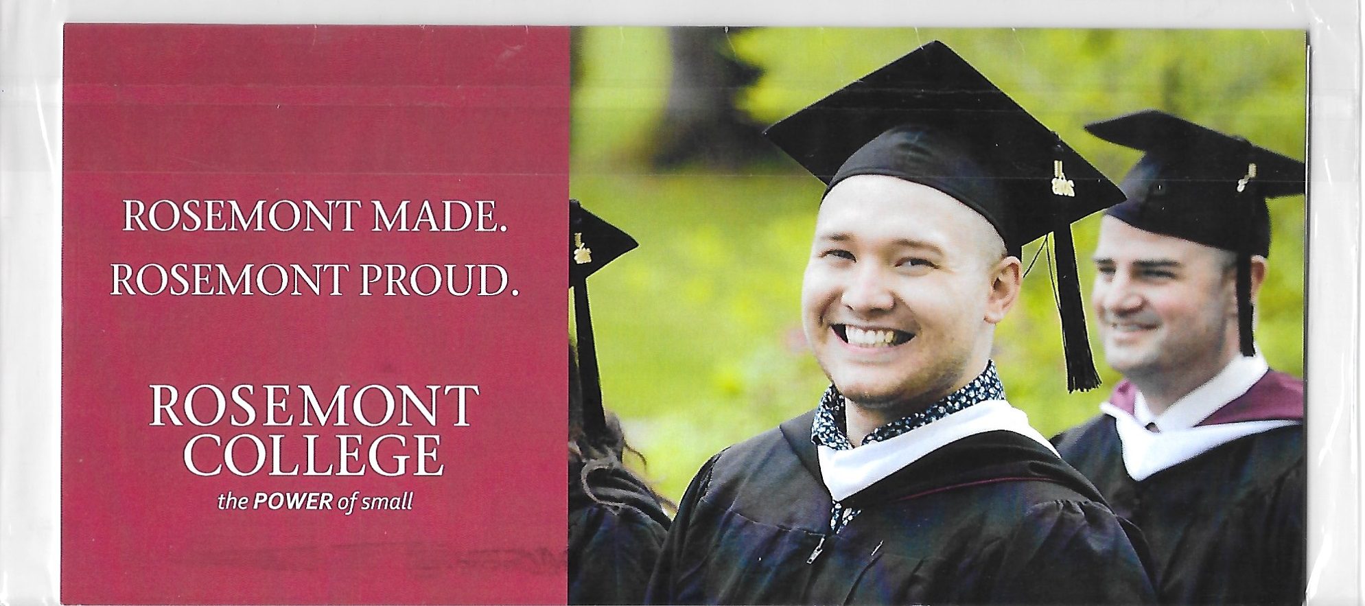
Pull-Tab/Zip Strip: This alternate method can be more interesting than just ripping open a back flap.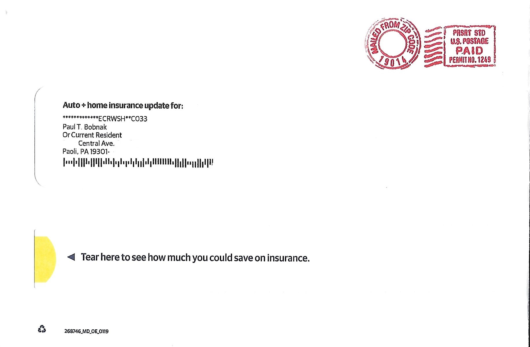
Teaser Copy: All by itself, a provocative or intriguing headline – maybe one that pushes an emotional button or creates a sense of urgency – can get your envelope opened.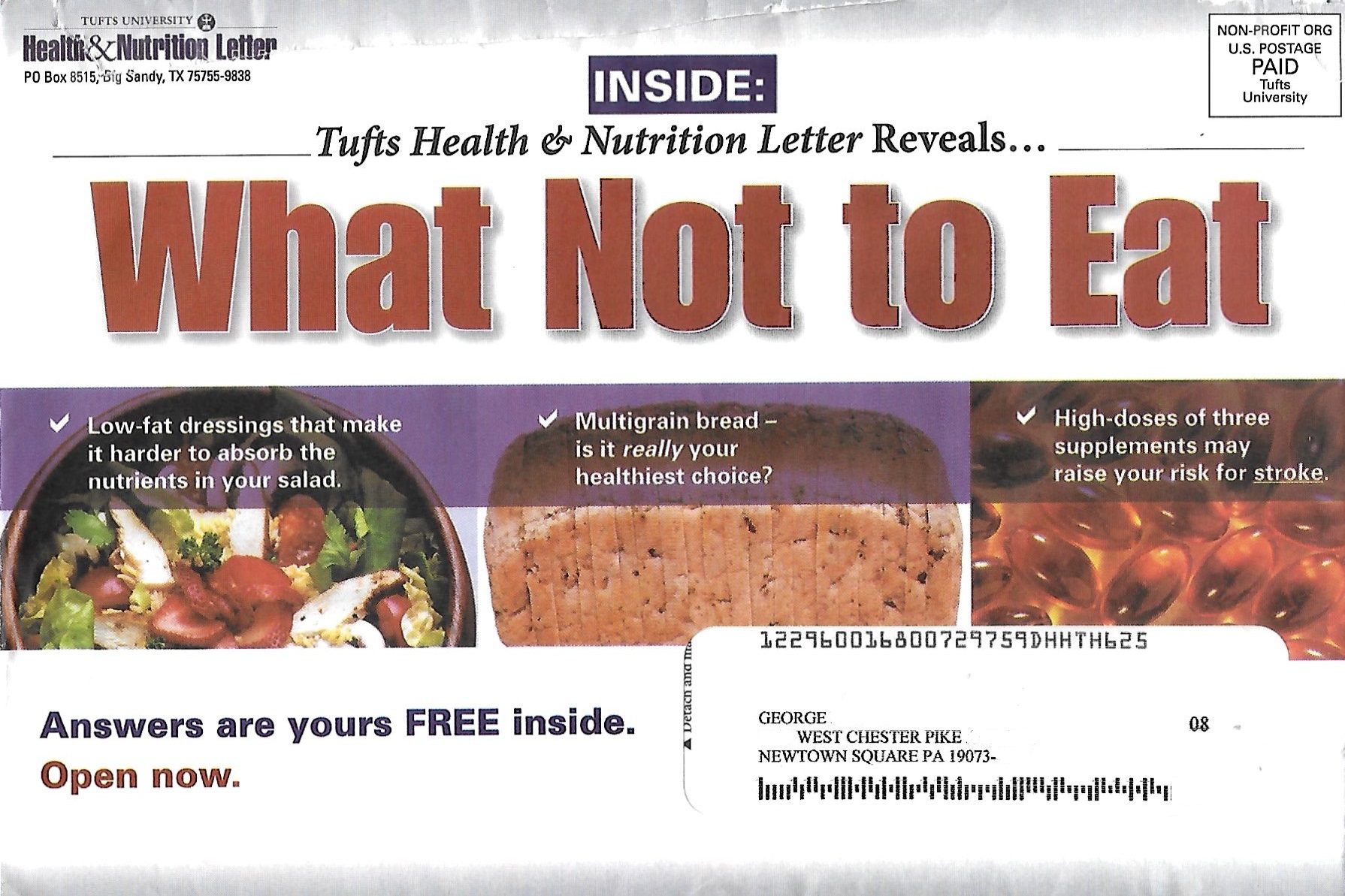
Postage: As with very other factor, the postage format can affect a recipient’s decision whether to open your mail piece. Indicia and postage meters seem more official and less personal than a live stamp.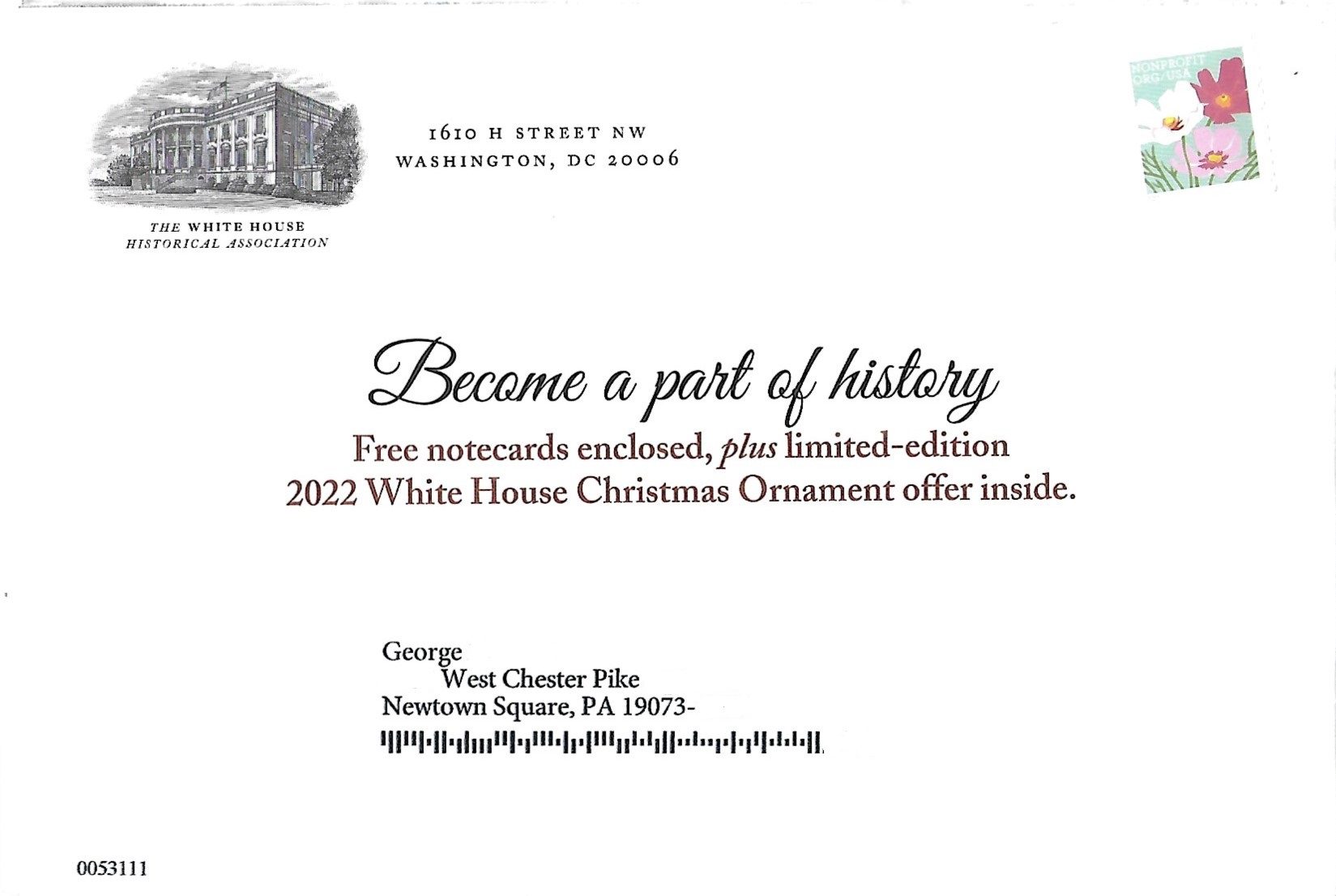
Extra Windows: Add an extra window next to your address window or on the back – or both! – to tease the contents inside the envelope.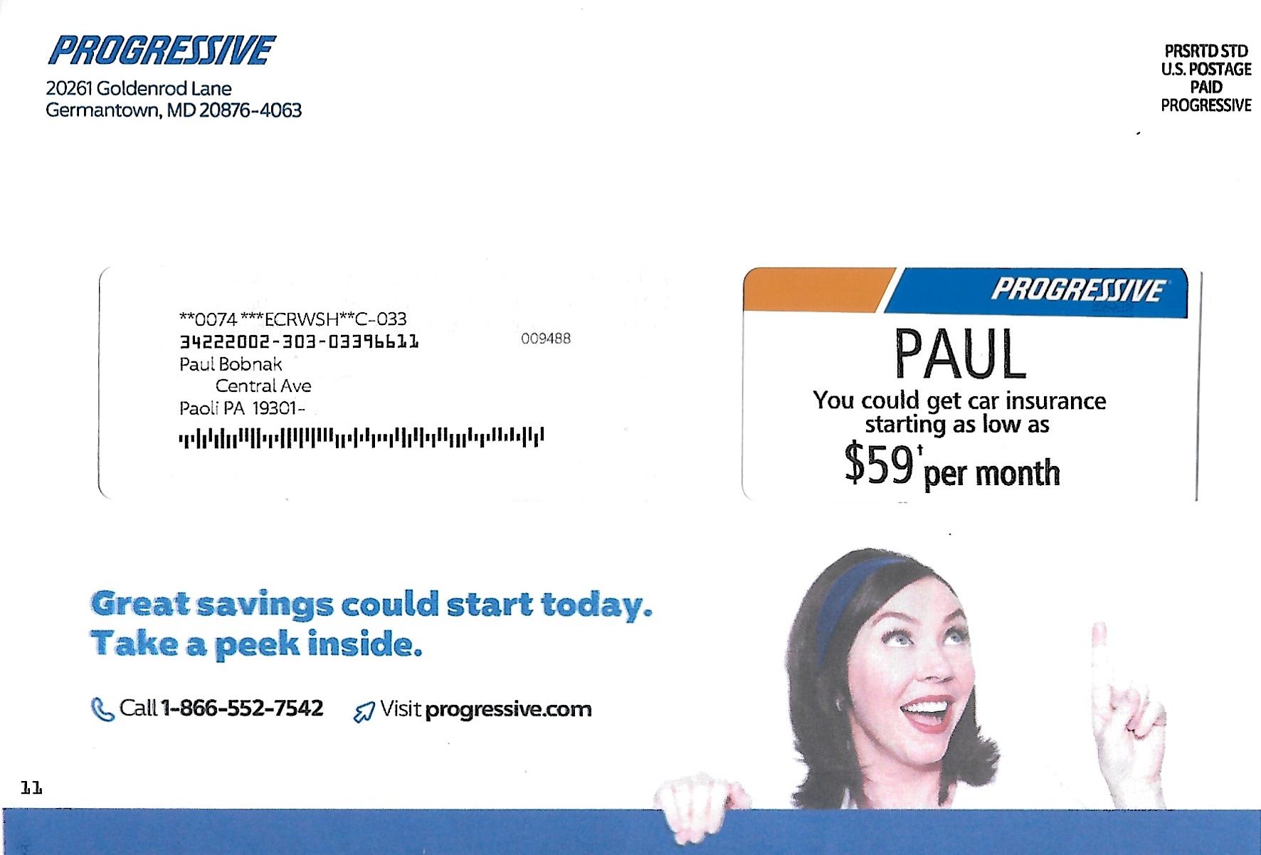
Personalization: Your prospects’ names can stand out as they sort their mail. But some printers target prospects with targeted, 1-to-1 personalization using variable images, maps, and copy details right on the envelope.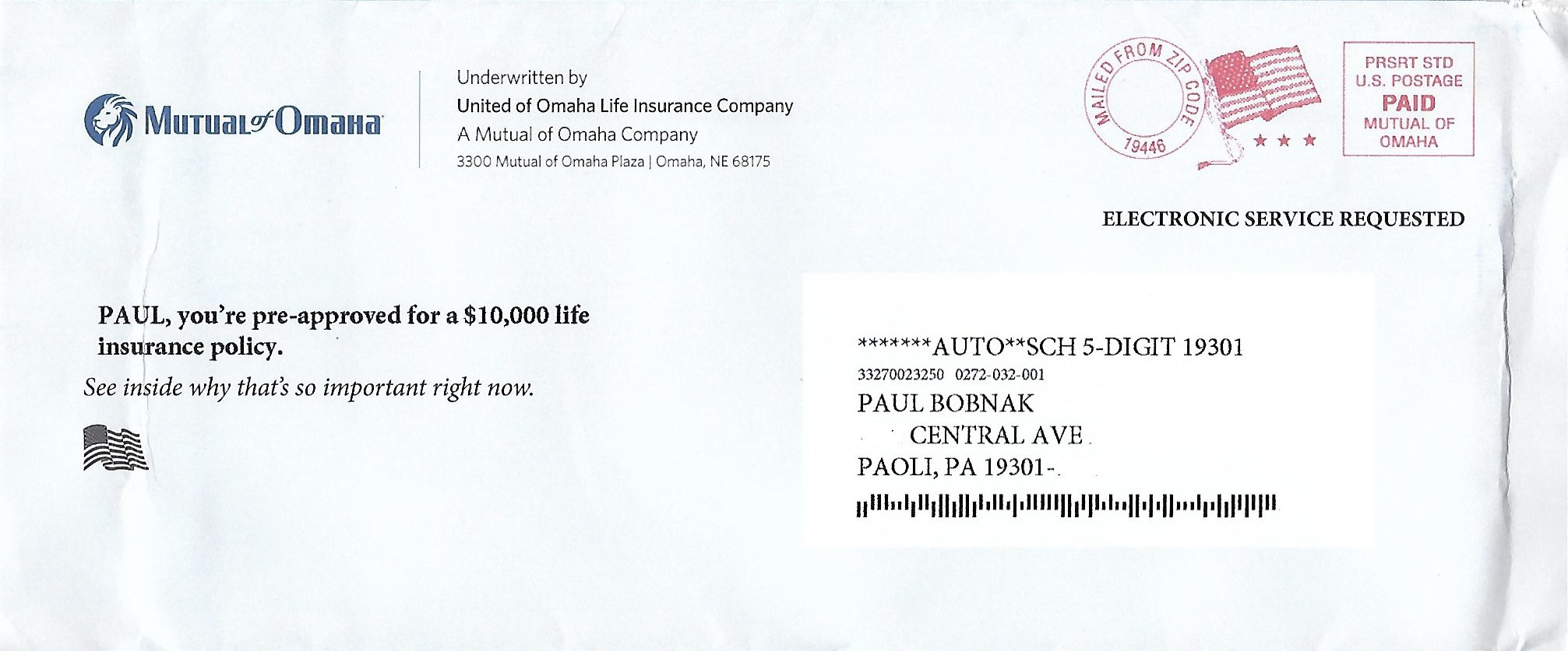
Color: Plain white says “blah.” Add some “wow!” with solid-color envelopes or even 4-color bleed-to-the-edge images.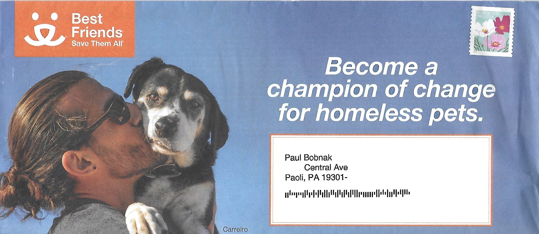
Paper & Ink: Your envelope must meet USPS thickness standards to run through the postal machines. Still, you have plenty of leeway for various paper stocks, embellishments, and finishes. Your printer should be able to advise you. If not, run your questions past the USPS, including our in-house USPS verification staff.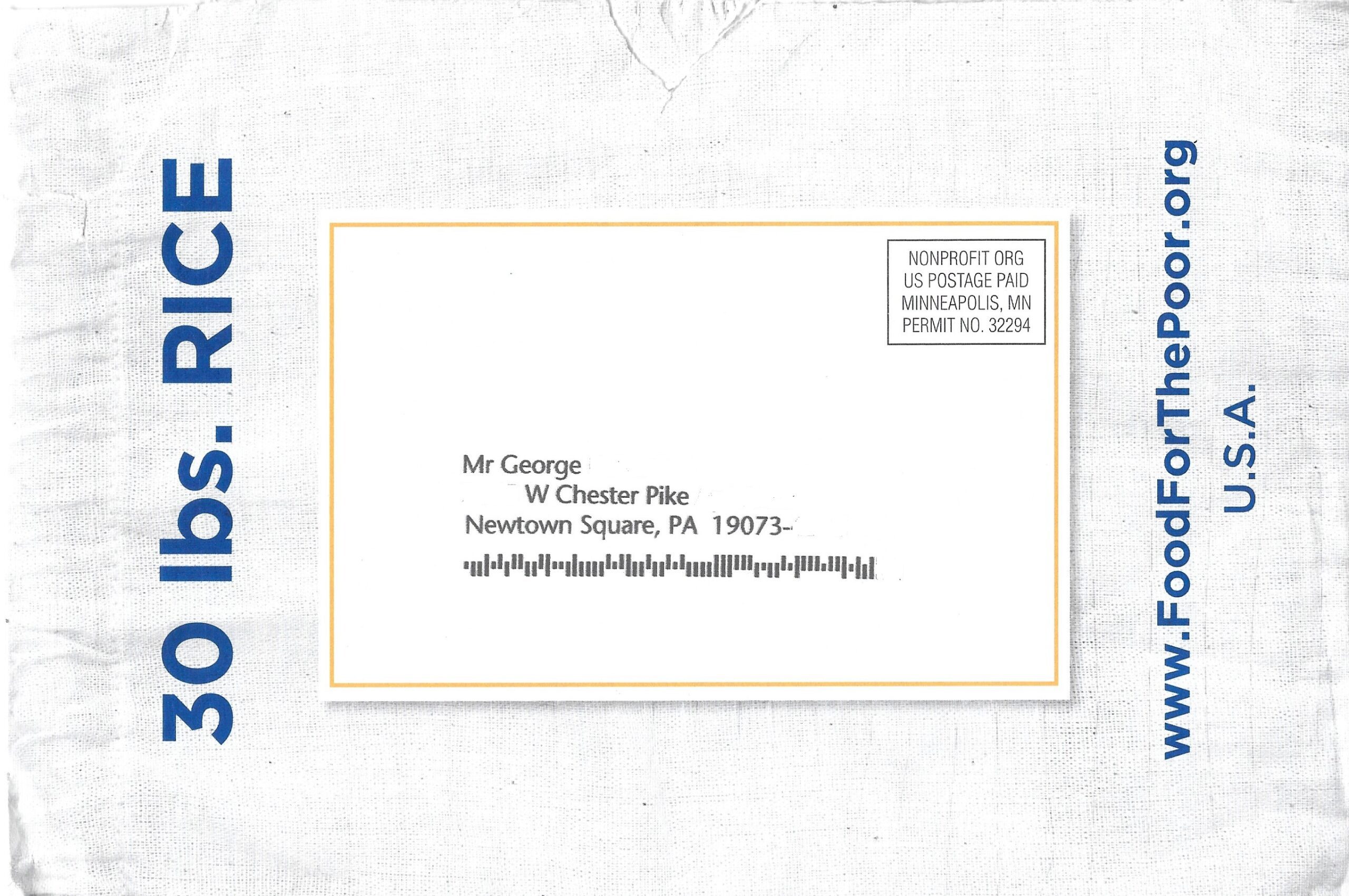
Creating an envelope that works
Great envelopes are converted, not born.
They start as rolls of paper or flat sheets. With in-line cutting, scoring, folding, and gluing, they can be produced in a range of sizes and engaging styles.
Converted envelopes give marketers more flexibility than stock envelopes. They’re ideal for many visual and tactile embellishments that reinforce a company’s brand and meet specific promotional needs, such as these:
- Full-color, full-bleed images and designs that can wrap around or cover the entire outside
- Embossing or debossing of one or both sides
- Foil stamping on one or both sides
- Soft-touch, raised, or spot coatings
- Custom security patterns on the envelope’s interior
Stock envelopes, which are usually packaged until needed, are generally not customized. But because they’re already assembled, they can be integrated into campaigns and mailed with less lead time than converted envelopes.
Wrapping it up
Envelopes give you an amazing variety of choices to carry your message to prospects and customers.
Even better, you can capitalize on the affinity that Millennials and Generation Z have for all things print. Use envelopes with visual and tactile appeal, as well as a smart or intriguing headline or brand name.
Remember, you can use any of these tools by themselves or in combination for greater impact.
Need more details on how your envelopes can stand out and get opened? Contact the experts at mailing.com!


