Direct Mail Campaign Spotlight: MetLife
By Paul Bobnak | January 9, 2018

In this post you will find a complete breakdown of a 2017 MetLife direct mail campaign. It will cover the campaign front to back and at the end of the post you will find key takeaway ideas!
Mailed: October 2017
Marketer: MetLife
According to the most recent U.S. Census Bureau statistics, about 11.2 percent of Americans move every year. Although this rate represents a decrease from previous years, new movers represent one of the most potentially valuable segments in life event marketing. They’re ideal prospects, ready to be contacted for a wide variety of products and services that can help them settle in to their new home and community.
This direct mail package was sent by MetLife to employees of Extensis, a Professional Employee Organization with whom it is partnered. And although it looks simple – just an envelope and a letter – there’s more here than meets the eye.
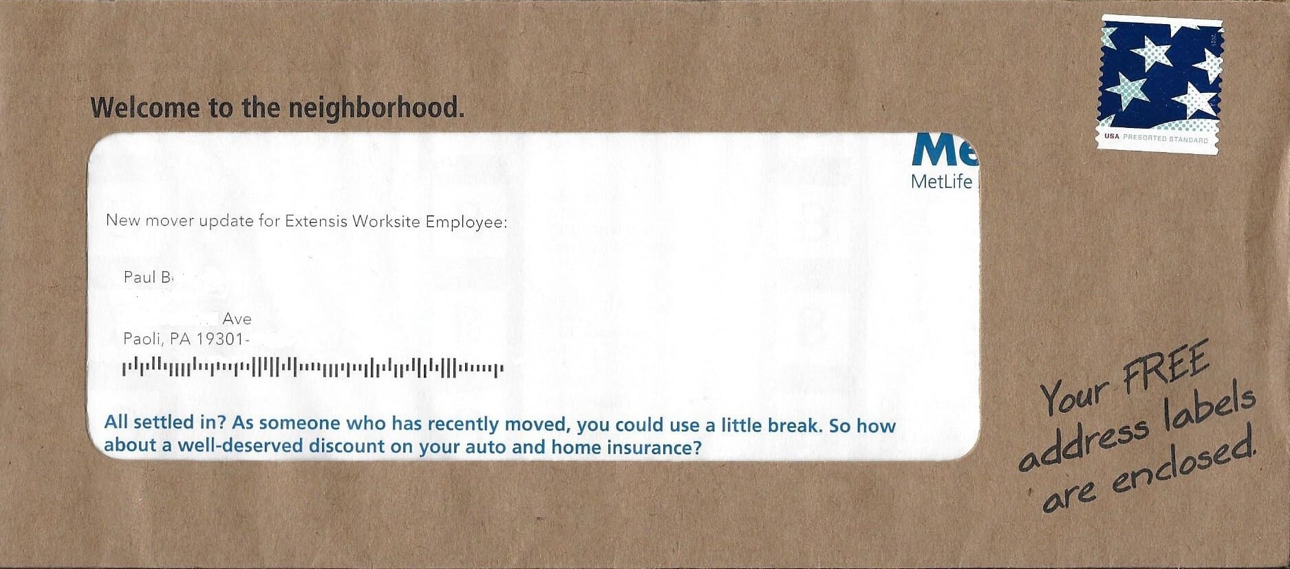
The #10 outer is a “brown bag” envelope; its rough, grocery-bag texture and oversized address window immediately stand out in the mailbox. “Welcome to the neighborhood” reads the teaser at the top of the window, while another bit of copy tells the reader that “FREE” address labels are inside.
There’s no MetLife branding except part of the logo that shows through the big window. The standard bulk-rate live stamp is another welcoming, personal touch.

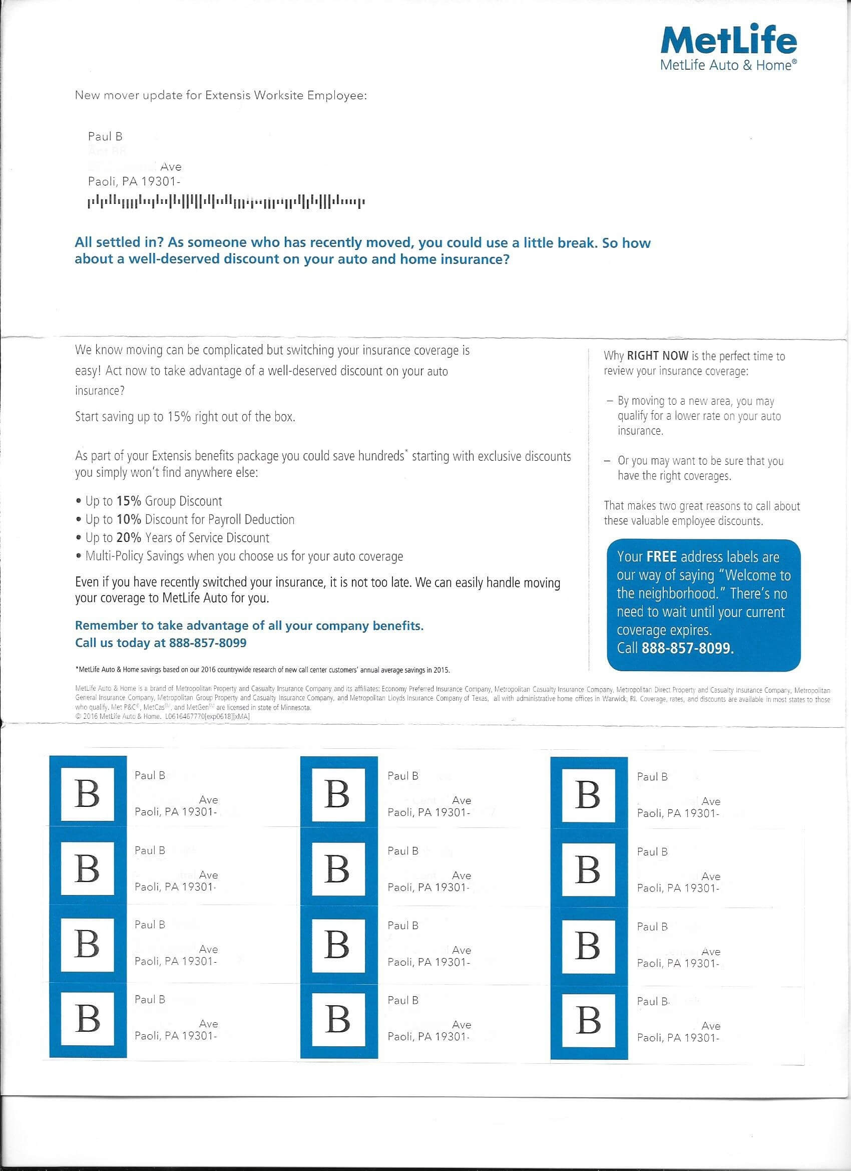
The single-page letter, unlike most insurance campaigns, lacks a salutation, close, and signature. The bolded copy just below the address area notes that the employee has just moved and “could use a little break,” like savings on insurance. Because all of this Johnson Box copy showed through the window, it’s actually a second exposure to the offer for car and home insurance discounts.
The paragraphs that follow leverage the exclusive affinity relationship with MetLife by laying out possible discounts on both single and multi-policy insurance products. And it anticipates a common objection – that a new mover may have already switched their coverage – by advising that “we can easily handle moving your coverage to MetLife Auto for you.”
In the right rail of the letter, MetLife gives the customer two reasons to review their current policies “RIGHT NOW.” It repeats the recommendation from the main body of the letter, that the consumer doesn’t have to wait to consider a new insurance provider.
The sidebar also points out the freemium included in the mailing. The bottom third of the page is a prefed sheet of 12-up labels, personalized with the new mover’s name and address.
Wrapping it up
- Grab your prospect’s attention by using an envelope with an unusual texture.
- Use an oversized window (or a second window) to show just enough of what’s inside the envelope, and get it opened.
- An old-school tactic – like address labels – can provide value to a prospect after a big life change like moving.


