7 Best Direct Mail Teasers of 2018
By Paul Bobnak | March 6, 2019
So, your customers are standing over their recycling bins, going through their mail for the day. How can you stop them from tossing your mail piece?
Use a great teaser!
The teaser is the headline on the outside of an envelope or self-mailer that gets the recipient’s attention. It disrupts the normal chain of thought by saying “Open Me!”
It might sound easy, but it’s actually pretty difficult. Which words, in which combinations, can stop people cold and start the process of getting your mail read?
“Attention Requested” … “URGENT” … “Important Information Enclosed” – they’re all so bland and appear so often that their impact today is small if anything.
I read a ton of mail every week. Here’s my list of seven campaigns from 2018 that used engaging teasers.
TD Bank
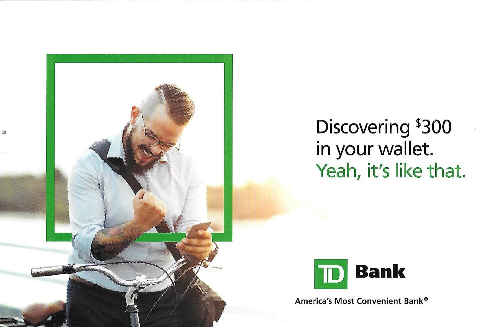
Everyone loves free money, like the fist-pumping guy on the front panel of this folded self-mailer (see above). “Discovering $300 in your wallet,” the teaser reads. “Yeah, it’s like that.” To find out how to get the $300 – the implied surprise or reward – the prospect has to open the mailing and read details about the bank’s checking accounts.
Sierra Club
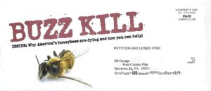
This membership campaign – centered on the destruction of bee species – has been around in different forms since 2016. Short copy for the win! The “BUZZ KILL” teaser is about as simple as you can get, displayed in all caps in a distressed typeface that’s titled at an angle, just above the image of a dead bee.
Consumer Reports
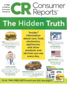
The front cover promotes a subscription to the magazine by promising “The Hidden Truth.” The mini-facts or “fascinations” below the magalog’s headline also tease “the truth” with specific page numbers for the consumer to look up inside.
Personal Capital

Questions are an underrated tactic when they’re posed in a direct mail piece. They create reader involvement. When they’re answered, they inspire the customer to act. In this case, an online financial advisory service expresses the unease that many people have: “When will I have enough money to retire?” The website illustrated on the tablet highlights the features of its planning tool.
Healthy Directions
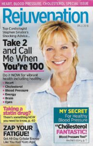
Marketers have long tapped experts to bolster the credibility of a direct mail campaign. The doctor’s recommendation “Take 2 and Call Me When You’re 100” spins the classic saying to promote a supplement. The digest-sized format and design of this mailer’s cover bear a striking resemblance to health magazines like Prevention.
Subaru of America

Teasers can support a company’s or nonprofit’s brand identity, as in this mailing for the car company’s special sales event. “The road may end, but your Subaru keeps going” reads the front, alongside a vehicle on a dirt path.
Citi

Credit card issuers talk a lot about points or dollars in their acquisition campaigns. But connecting those rewards with a tangible end goal is how this effort distinguishes itself. “Better Travel Begins Now” – and a photo of couple enjoying a trip to Barcelona – illustrate the benefits of earning miles on the bank’s airline-branded MasterCard.
How to create your own tantalizing teaser
To craft an effective or powerful teaser, follow these guidelines.
1. Don’t spill all of the details
Offer just enough information to pique your prospect’s interest. Anything more – unless it’s a truly stunning price or offer – is too much and won’t get the piece opened or read.
2. Appeal to a feeling
Use one of the 7 main emotional copy drivers: fear, greed, guilt, anger, exclusivity, flattery, and salvation. People make decisions based on emotions and then justify them with facts or reason.
3. Fulfill the reader’s expectations
Part of a teaser’s job is to introduce or support the marketer’s message. Make sure there is no disconnect between the two.
4. Repurpose your teaser for other channels
The great thing about direct mail teasers that have worked well in the past – or even today – is that they can be adapted for email subject lines or preheader text, as well as social media posts.
As noted copywriter Lea Pierce says, “You have three seconds to live or die” when customers look at your mail. Make the most of that time by thinking hard about the words that will grab your audience’s attention. Then, back them up with an irresistible pitch or offer.
Need helping crafting your direct mail campaign? Contact our experts at mailing.com!


