15 Quick Examples How Your Direct Mail Creative Can Improve
By Paul Bobnak | April 7, 2022
Creative direct marketing ideas – when used properly in a direct mail campaign – engage prospects and customers.
Yes, driving response is important. But creative direct marketing ideas – like the ones used by Amazon, Subaru, and Capital One in their mail (see below) – do more. They provide information, create intrigue, build brand, and spread awareness.
Every part of the direct mail piece you use for your campaign should be dedicated to at least one of the following:
- grabbing attention
- creating interest
- building desire
- instilling conviction
- prompting action
Working together in harmony, your ideas, ink, and paper keep your prospect or customer engaged with your business, product or service, and message.
In this post, we’ve come up with some creative direct marketing ideas in direct mail strategy, design and copywriting to inspire your work.
1. Greeting Card
 Mailer: USO
Date: December 2020
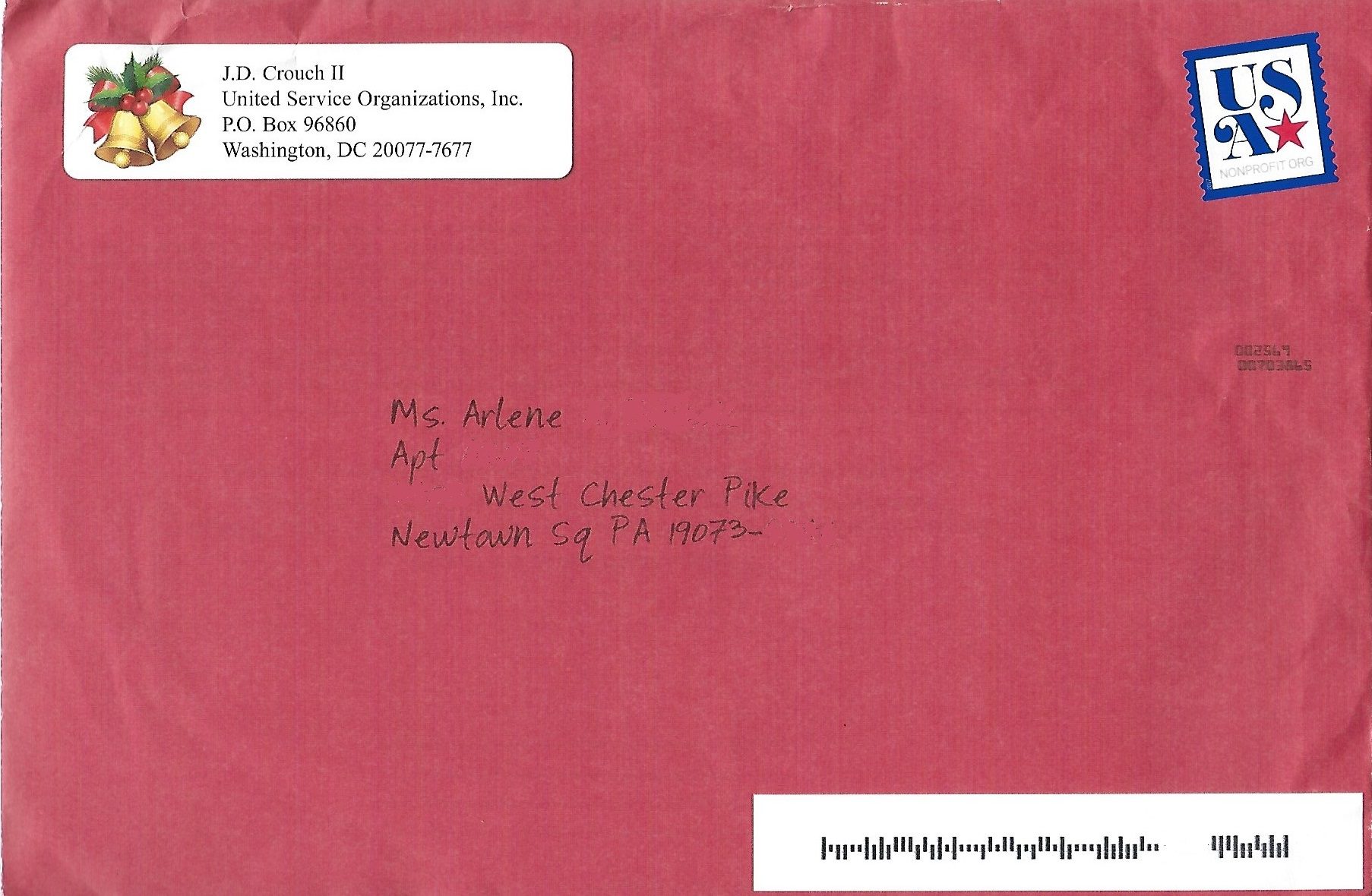
Why It Works: Most people like getting cards in the mail — birthday cards, anniversary cards, holiday cards, etc. Here, USO reached out to its supporters with a holiday campaign mailed in a typical greeting card outer — notice the live stamp (tilted at an angle) and the handwriting font. And inside is a Happy Holidays card from the non-profit.
2. Spot Gloss
 Mailer: Naked Wines
Date: March 2021
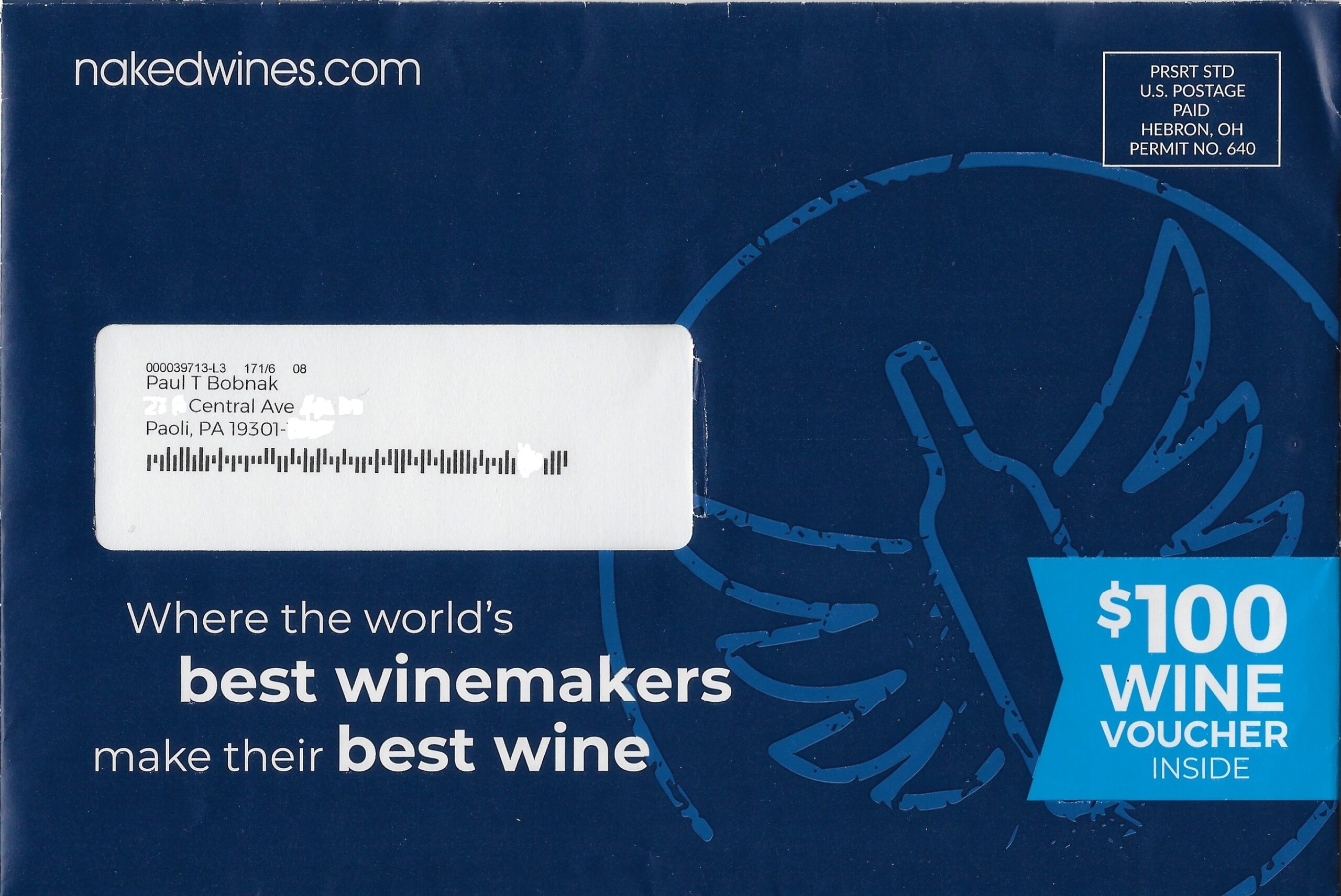
Why It Works: The front of the outer envelope was printed with a spot UV coating for the wine club’s angel wings logo. This treatment makes it pop against a dark background.
3. Lanyard & Badge
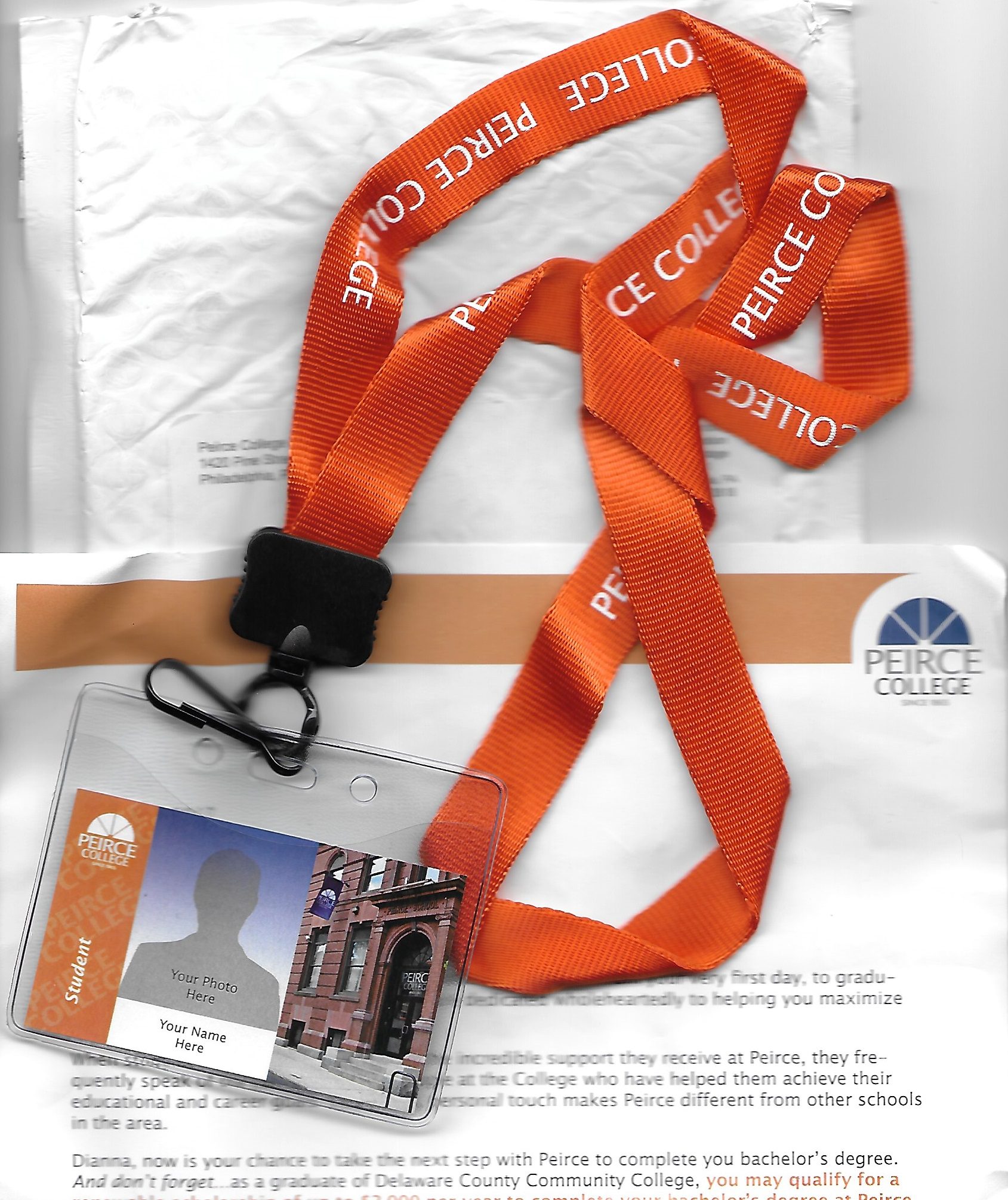 Mailer: Peirce College
Date: August 2017
Why It Works: Recent community college graduates were targeted with a campaign to drive student visits to the campus of a 4-year school. A sample ID and lanyard – mailed in a padded envelope – creates interest because it is “lumpy” mail and helps create a sense of belonging.
4. Endorsements
 Mailer: Subaru of America
Date: January 2021
Why It Works: The front of this 6”x11” postcard shows 2 vehicles (and their financing) from the carmaker. To build audience credibility for its automotive audience, both sides highlight their safety (IIHS) and value (ALG) ratings as well as the dealers’ recognition by Subaru for outstanding community service.
5. Scratch-Off
 Mailer: Acts Retirement Life Communities
Date: December 2019
Why It Works: Who doesn’t like to win something? Rather than promote a gift (or discount, special price, etc.) upfront, a scratch-off feature on a mail piece creates suspense about what might be revealed. All kinds of companies and organizations can use this tactic.
6. Magnet
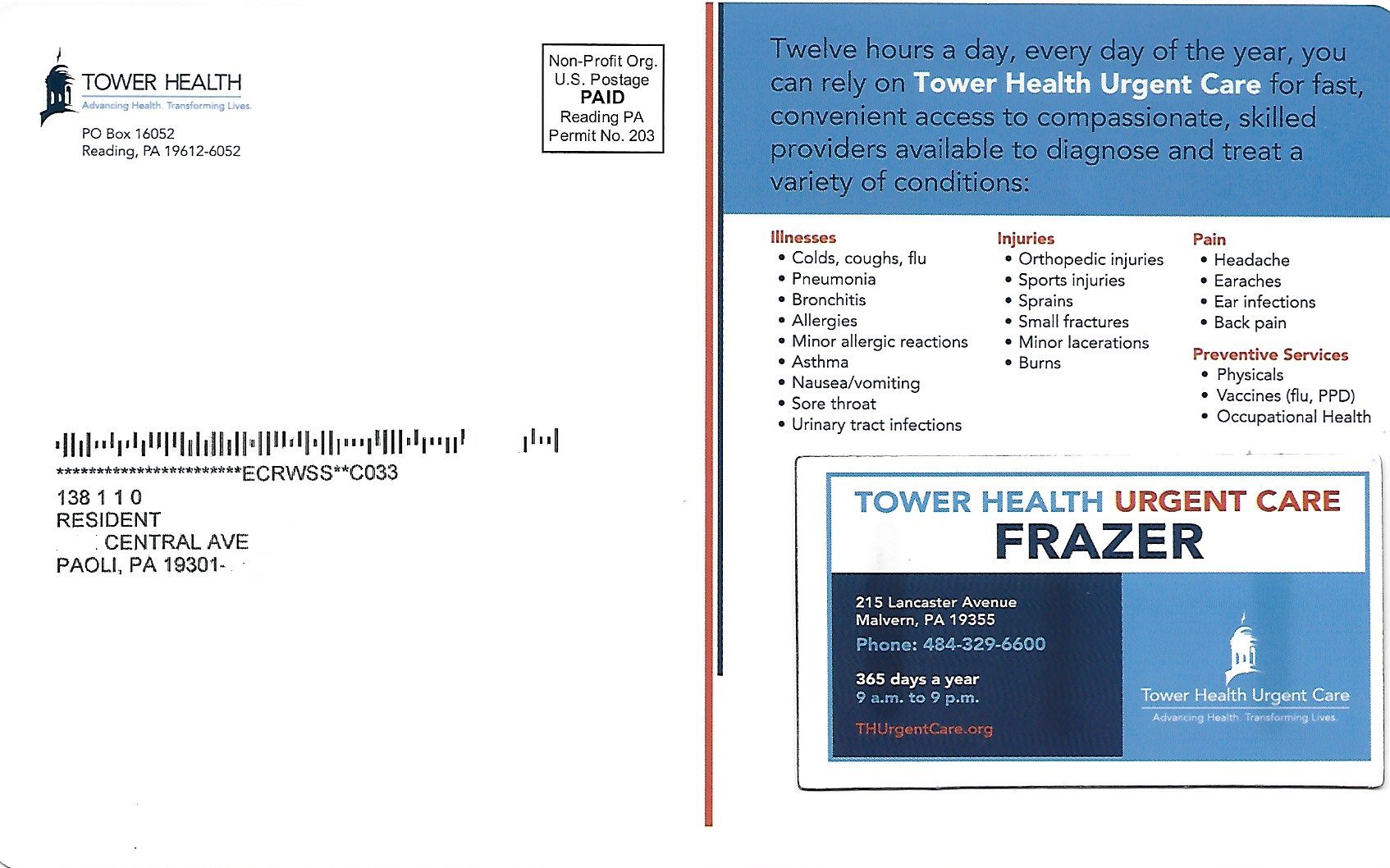 Mailer: Tower Health
Date: June 2019
Why It Works: Magnets in direct mail are versatile. Because they are tangible, magnets can reward supporters, keep your mail piece visible (for example, on a refrigerator), create brand exposure, and supply information. This magnet, spot-glued to a postcard, provides basic, but crucial details on a nearby urgent care center.
7. Textured Outer
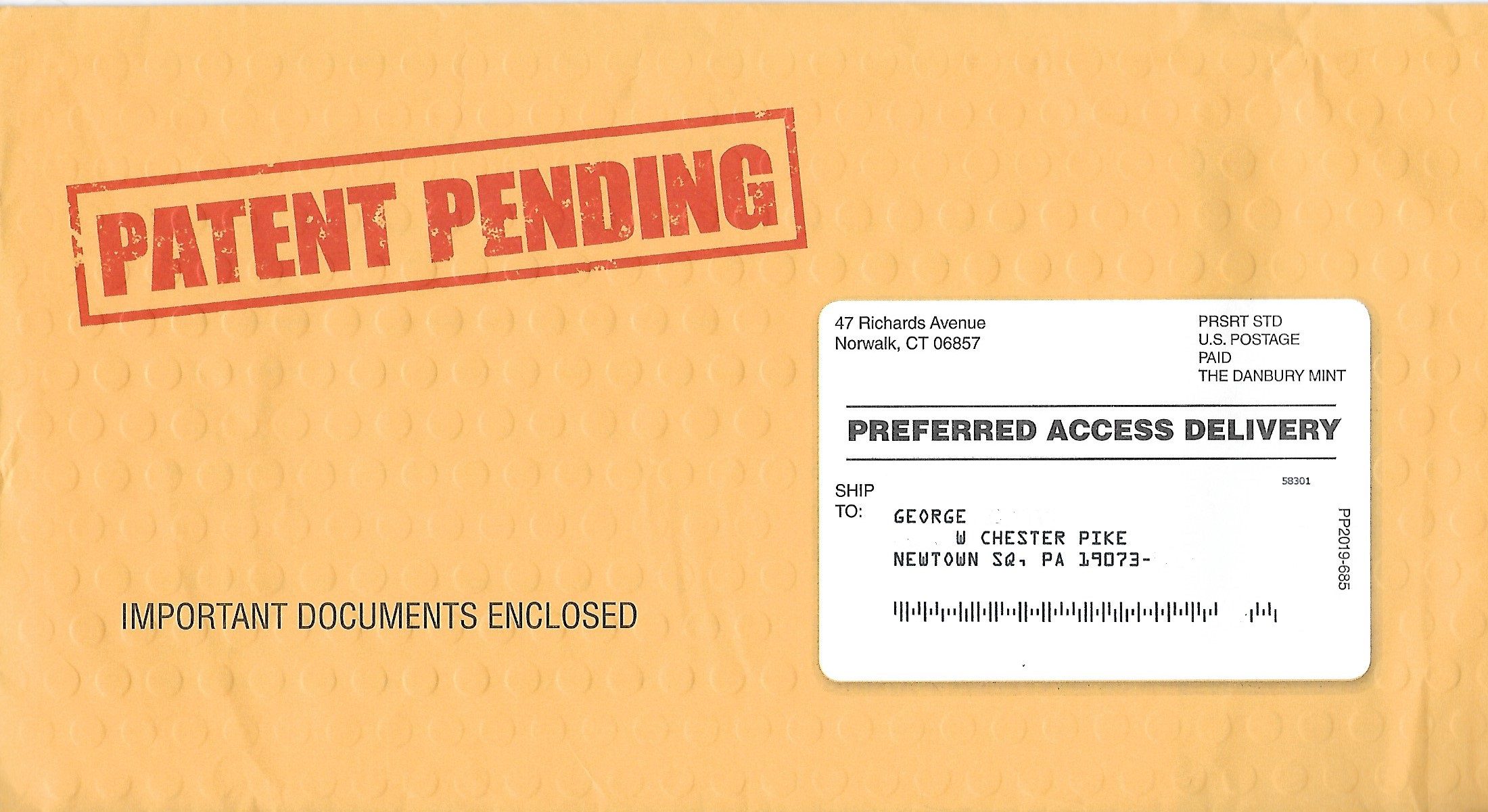 Mailer: Danbury Mint
Date: December 2020
Why It Works: Your mail can make a physical connection with a customer by using paper or ink that feels different in their hands from typical mail. This campaign was mailed in a dimpled jumbo (6”x11”) envelope that included a large brochure for limited edition dollar coins from the U.S. Mint.
8. Die-Cut Window
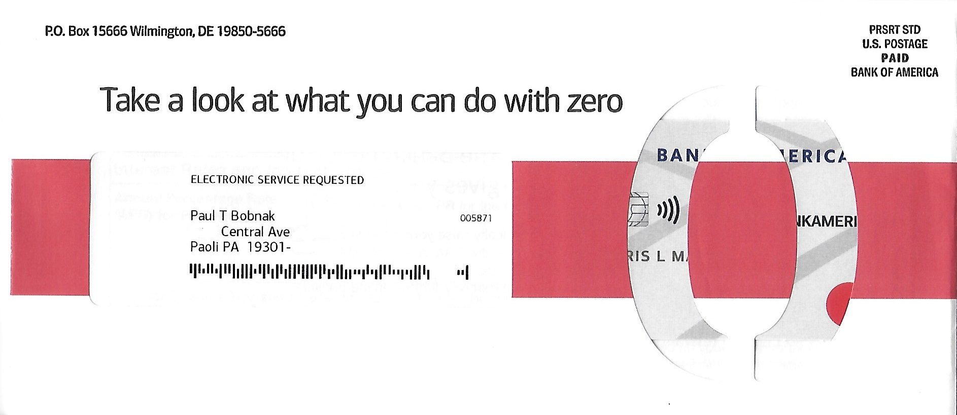 Mailer: Bank of America
Date: December 2021
Why It Works: Envelopes use a second window (or an oversize address one) to tease something inside, like an image, graphic, or headline on a letter. In this case, the window is die cut in the shape of a “0” – supporting the credit card company’s promotional APRs and annual fee.
9. Clear Envelope
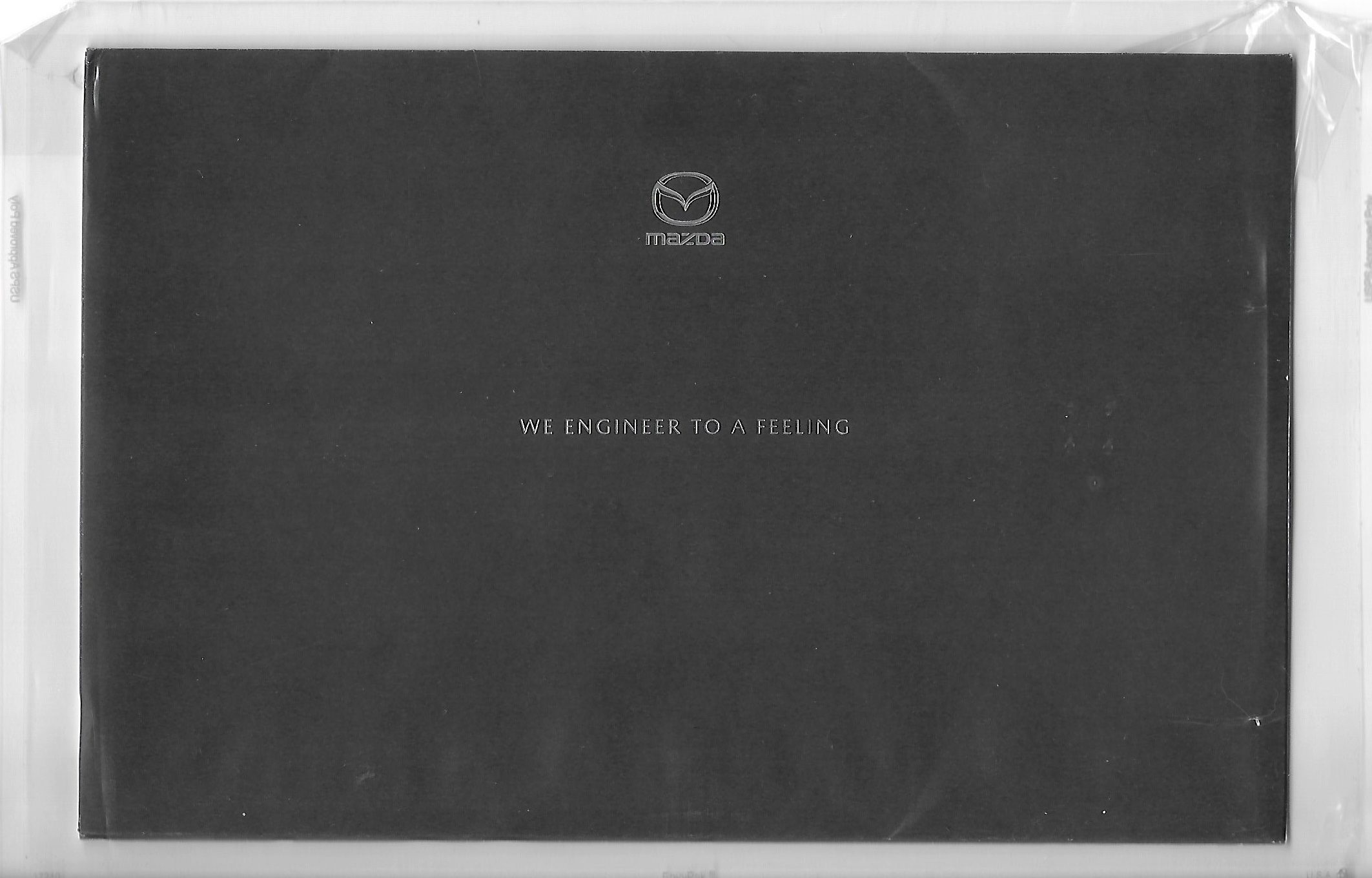 Mailer: Mazda
Date: January 2020
Why It Works: To get a current driver to consider a new car, the automaker mailed a promotion in a 6.5”x10.5” clear poly envelope. Inside, a sleeve with only the company logo and a teaser “We engineer to a feeling” appears, creating intrigue for the booklet and special offer it contains.
10. Puzzle Involvement Device
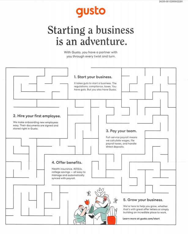
Mailer: Gusto
Date: October 2020
Why It Works: Good involvement devices make your customer think about your offer or your brand in a different way than sales copy does. A crossword or a labyrinth like the one used here illustrates how HR benefits marketer Gusto helps its business clients grow.
11. Multiple Tipped-On Cards
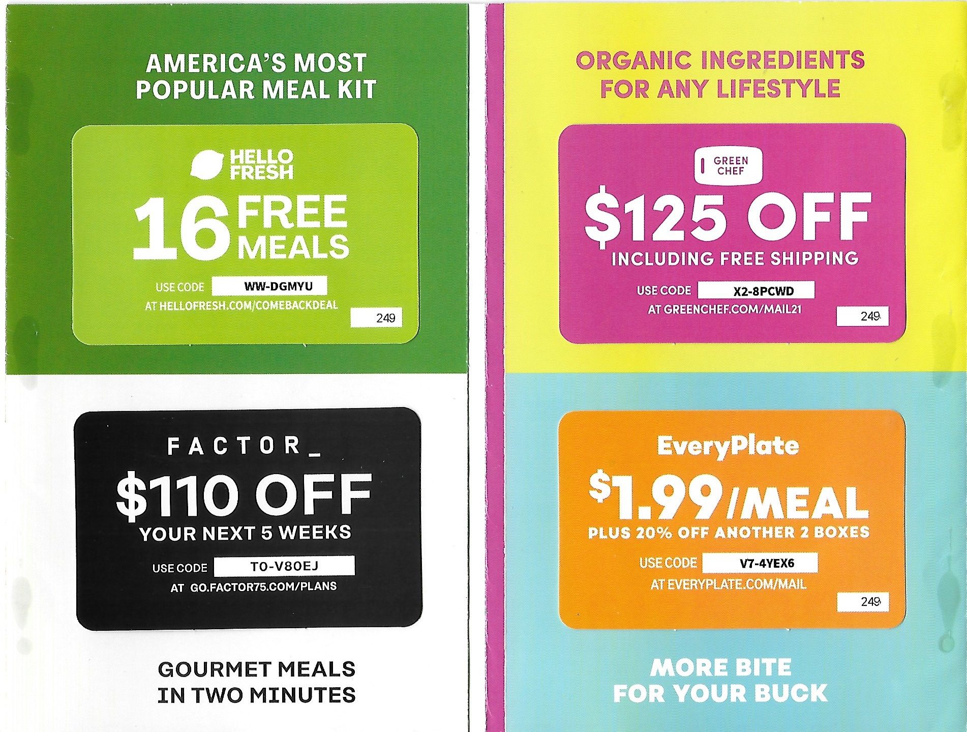 Mailer: Hello Fresh
Date: December 2021
Why It Works: The meal kit provider reached out to former subscribers with a folded self-mailer that included 4 tipped-on cards on the inside spread. Each card makes a special offer tied to one of the separate food plans found on the 4 panels on the innermost spread. Thus, depending on their current interests, this gives them several options to return as a customer.
12. Shape-Cut Envelopes
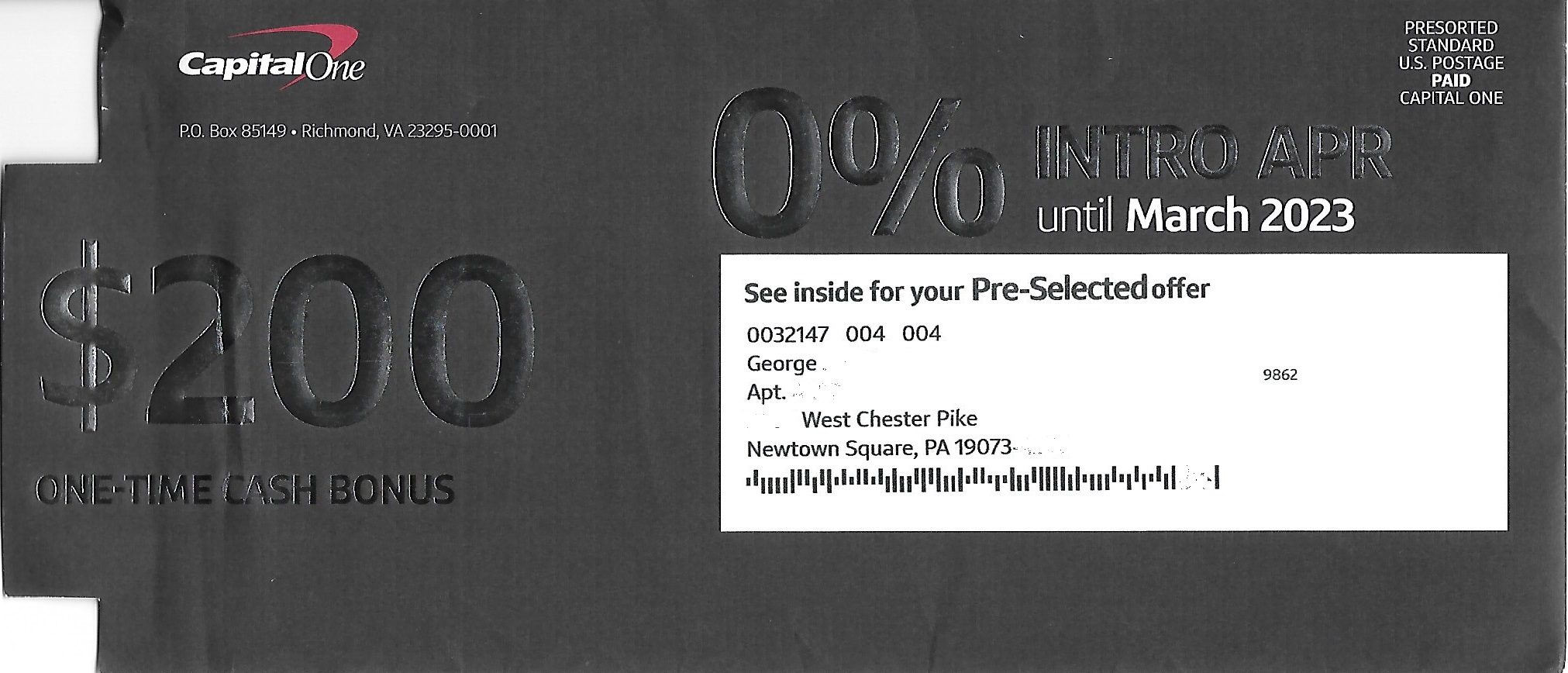 Mailer: Capital One
Date: December 2021
Why It Works: Letter-sized mail doesn’t have to look or feel the same way. Cut outs on the trailing edge of an envelope help it stand out with a USPS-approved shape, usually square or circular, that has visual as well as tactile appeal. Here, the shape cut highlights the $200 cash bonus for accepting a new credit card.
13. Virtual Try-On Tool
 Mailer: L’Oreal
Date: February 2022
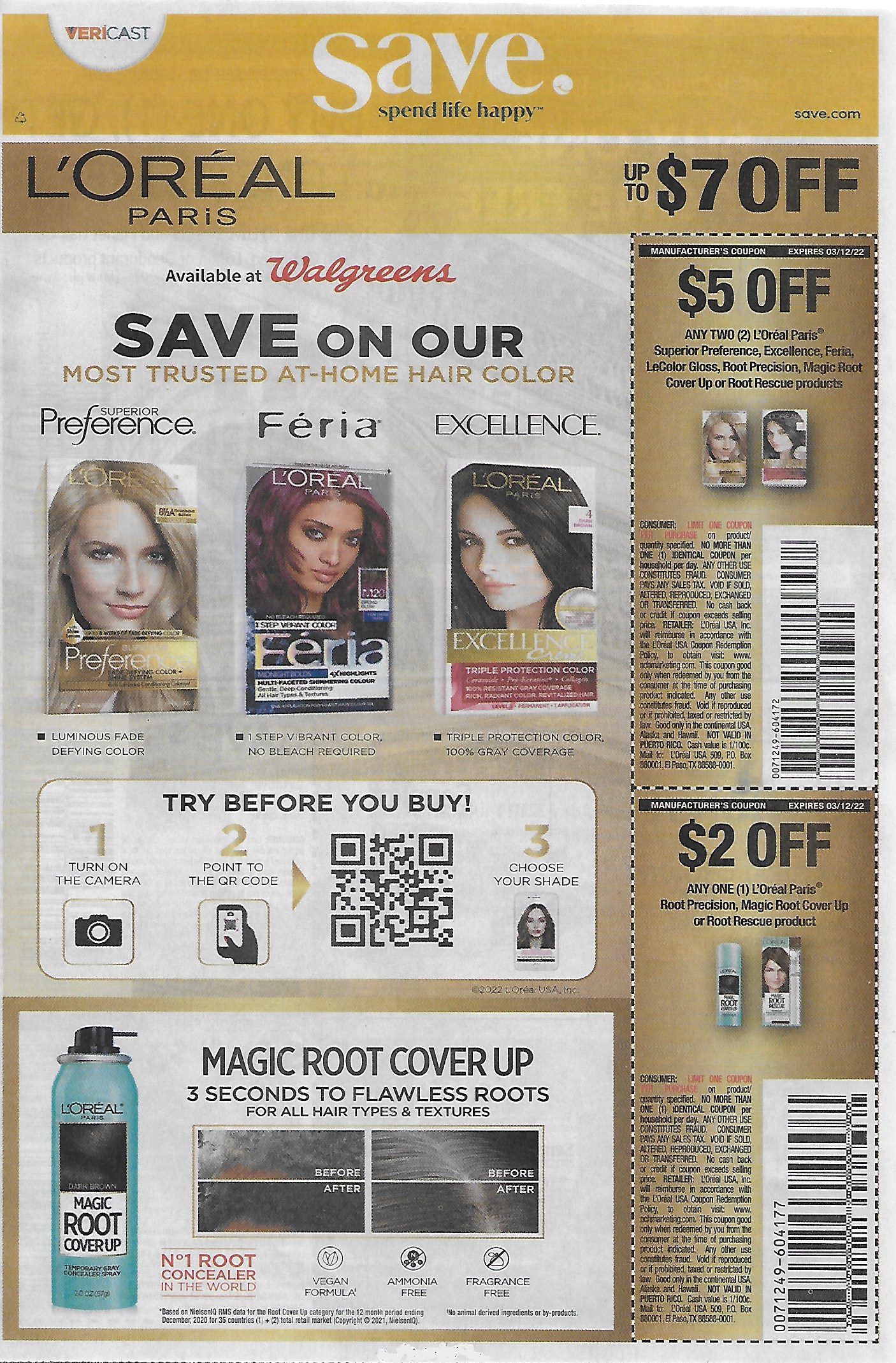
Why It Works: Among the weekly inserts mailed to millions of Americans every week by Vericast are coupons for various consumer products, such as hair color. By scanning a QR code, consumers access an augmented reality tool that lets them virtually “try on” beauty products. AR simulation technology that already exists for other products and services gives people another way to customize their shopping experience.
14. Punch-Out Plastic Card
 Mailer: Good Rx
Date: January 2022
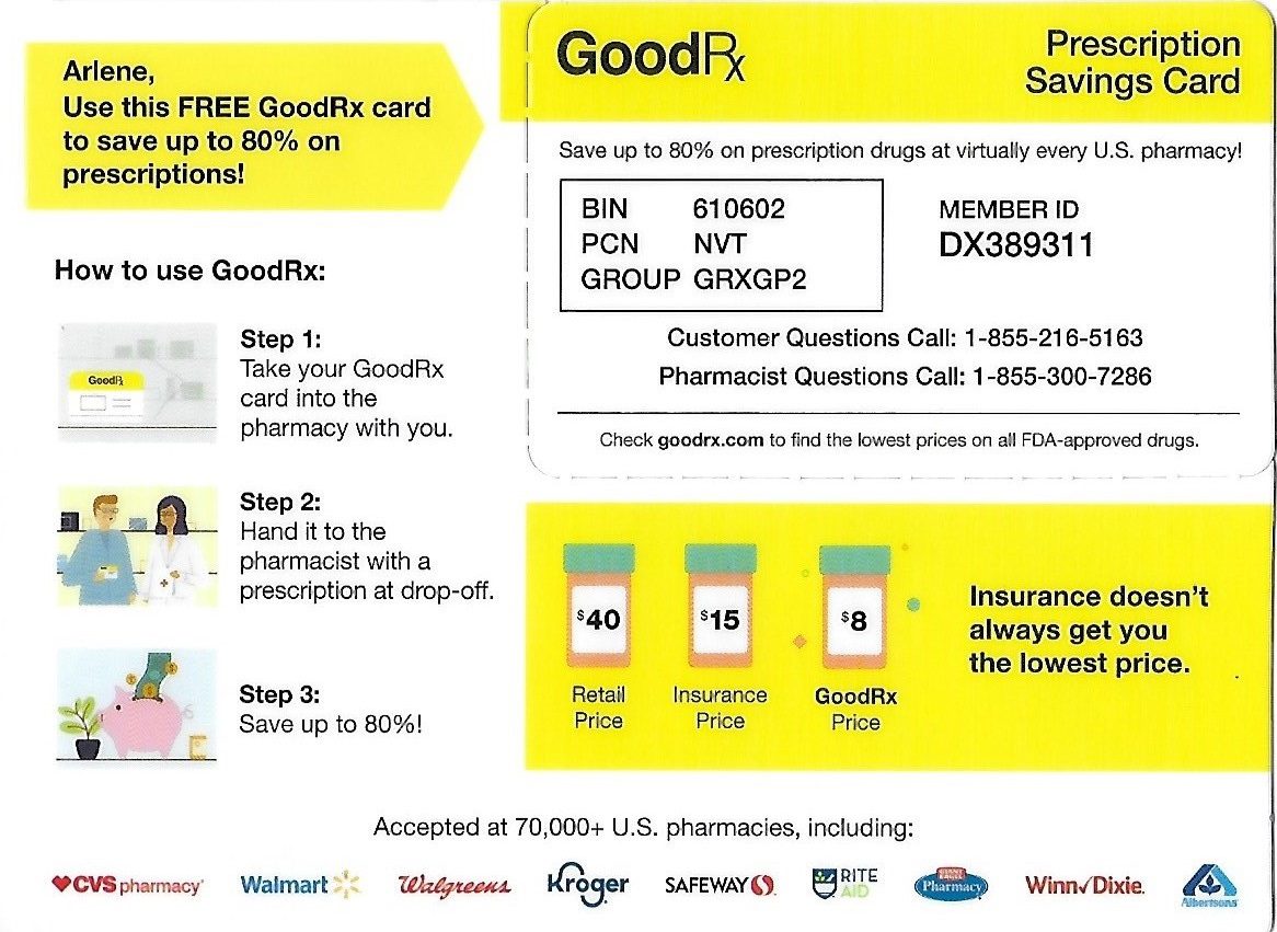
Why It Works: This thick plastic postcard contains a diecut card that can be detached. In this example, the discount prescription drug company’s campaign includes a convenient punch-out card that can be easily presented at a pharmacy.
15. Stickers for Kids
 Mailer: Amazon
Date: October 2020
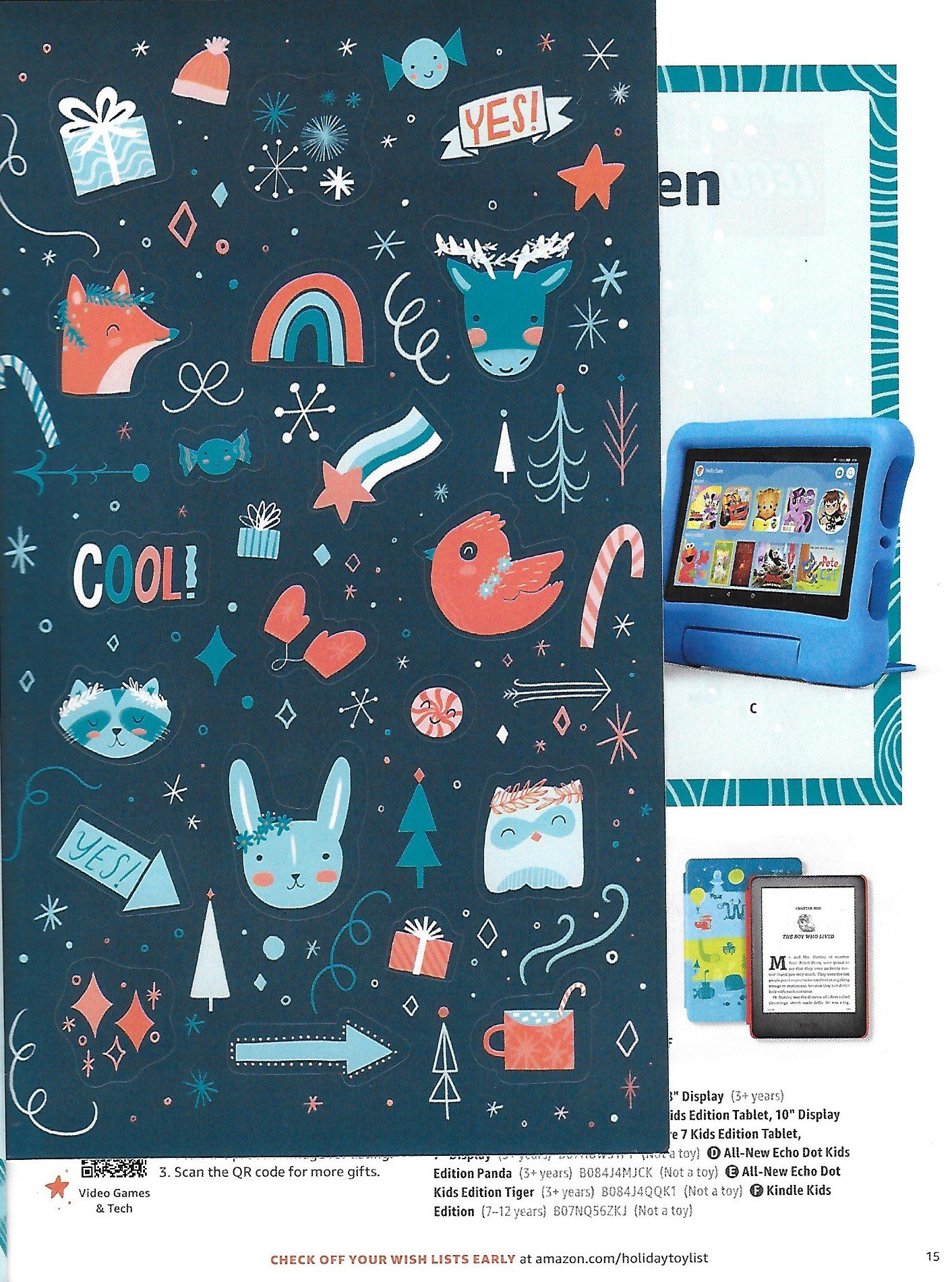
Why It Works: Mail should be fun for children as well as adults. In its holiday toy catalog, Amazon includes a coloring page, a story, a maze, and a sheet of stickers to help children tag items on their wish list.
Wrapping it up
Hopefully, looking at so many creative direct marketing ideas provided ideas that can help you drive successful direct mail.
To cut through all the messaging clutter your prospects deal with every day, think carefully about how your mail can engage them in a fun way. Your campaign’s creativity and design should work together to grab their attention and keep building their interest and desire until they have no choice but to take action.
These examples prove it’s possible.
At mailing.com, our art and design experts will work closely with you to figure out the best direct mail creative practices for your brand’s individual campaign goals and budget. We make the entire process run accurately and efficiently, saving you time and money, and delivering peace of mind.
Need more details on how your mail can get acted on? Contact our team at mailing.com to get the most from your creative direct marketing ideas!

