Make Your Direct Mail Postcards Stand Out With These Tips
By Paul Bobnak | August 28, 2024

The postcard is one of the most basic types of direct mail. It’s right up there with letter mail or the catalog in its ability to capture the attention of your intended audience.
And because it’s a simpler format than those other two, designing and mailing one must be easy-peasy, right?
Well, it may be, but that doesn’t mean you’re doing it well enough to get good or even great ROI.
Not just any old postcard will do.
You might have accurate data, a smart strategy, and a good offer. But if your postcard design doesn’t work, you’re wasting your money, and worse, your prospect’s time.
Your postcards must cut through all the messaging clutter your prospects deal with every day. That’s the only way you can engage your target audience successfully and turn them into your newest and happiest customers.
Even if you’ve used postcards before, think hard about your creative elements.
- Do they really get your audience’s attention? How?
- Do they keep them interested enough so they don’t toss it into the recycling? (Be honest.)
- Do they get them to respond?
Here are direct mail postcard design tips that will help take some of the stress out of creating and mailing a successful marketing campaign.
1. Keep It Simple
Don’t try to make your postcard do too much.
It’s tempting to crowd it with lots of flashy sales copy and images, to try to cover as much ground as possible.
Don’t do it.
Your customers should learn a few key points with just one glance and a quick read. Maybe it’s about that sale you’re holding in two weeks for “valued customers.” Or maybe your dental office is introducing a new service. Whatever the message, keep it simple. Unless you’re mailing some coupons, stick to only one offer.
2. Get the Front & Back to Work Together
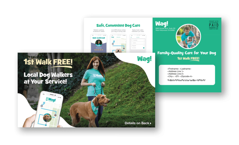
No matter whether your prospect sees the front or back of your postcard first, each side should support the other.
For example, you can put a simple heading like “FREE Shipping on ALL orders” on the front along with images or graphics. Use the address side to list two to three few bullet-pointed benefits that explain or back up your message.
It’s all about making it easy for your customer to figure out what you’re offering, and then, take action.
3. Go BIG
Under USPS regulations, a postcard has specific dimensional and thickness requirements to qualify for mailing at First Class presort rates. Thanks to input from marketers and printers, in August 2021, the maximum size of a “postcard” was increased to 6” high X 9” long, up from 4-¼” X 6”.
Here are the advantages of a larger First Class postcard:
- Additional real estate for copy, headlines, images, and digital elements like QR codes
- More white space to set all of those elements apart
- Great dimensions makes it stand out in the mailbox
- Faster delivery, return to sender, and address correction
Those advantages may have even more of an impact if you move up to a 5.5” X 11” or 6” X 11” postcard. However, be aware that for any size greater than 6.25” X 11”, postage will be at the flats rate. A nice alternative that saves money at a larger size is the Standard or Marketing Mail presort rate.
4. Run An Enticing Headline
Your postcard’s headline is one of the most important parts of your campaign. To be effective at grabbing the attention of your customer, it should be short and powerful. Use numbers, dollar signs, and percentages or that magic word “FREE”.
5. Show Great Pictures
It’s 2024. The right images – whether they’re professional-quality photographs, graphics, or logos – boost your message as well as your unique identity and credibility.
So your pictures should be:
- Clear, crisp, and high-resolution (no fuzzy or blurry images)
- Authentic and true to your brand
- Placed properly to support your headline or copy, not dominate them
6. Use Space Effectively
Remember what we said above about a crowded postcard?
Avoid the temptation of filling up all of that extra room with content. Instead, remember to create white space. Your offer, call-to-action, and other elements shine when they align with each other in a harmonious way.
7. Personalize with VDP
When printed with high-quality variable data printing (VDP), a postcard campaign is more relevant to the consumer because it uses their data. Besides name and address, a personalized postcard can include images and offers based on a prospect’s gender, purchase or browsing history, and much more.
And here’s something else you could try: if you want them to visit a physical location, create a customized map showing the route from their house.
8. Include QR Code or PURL
A QR code or PURL on your postcard helps your prospect bridge the gap from the physical world to the online one. Besides providing a mobile-friendly way to respond to an offer or appeal, these digital touchpoints give you an opportunity to present a unified and if you choose, customized experience of your brand on the web. They also help you easily attribute any sales or other interactions to the postcard they used to connect with you.
9. Emphasize Hierarchy with Colors
Colors can make a postcard appealing to the eye. Whatever your offer or message is, they can help the reader understand the hierarchy and flow of your text and images or graphic elements, emphasizing some and understating others. The proper arrangement of visual cues moves the customer along the sales funnel more quickly toward making a decision to buy.
10. Limit Information Carefully
Your customer’s attention is a precious thing. Along with the right headlines and subheads, focus them on the most important information, such as your offer and a few short bullet points. To provide additional details they may need to take your offer, direct the prospect to a landing page.
11. Make a Strong Call to Action (CTA)
Postcards aren’t subtle. They can’t afford to be.
So don’t make your prospects read through your copy to figure it out. Make it clear exactly what it is that you want them to do.
Some CTA examples:
- “Sam, contact us for your 2021 Subaru’s oil change appointment today.”
- “Visit our website to learn more.” (And post the link with just “www.”)
- “Call to Schedule Your First Cleaning and Get a Free X-Ray!”
It helps to set your call to action apart visually with a larger font, maybe in a different color of ink, too.
12. Review Creative
Be careful in your approach. You need to make sure that everything is exactly right in your execution, so that you’re providing people with the correct and up-to-date details. For example, make sure that call-to-action (see previous tip) is unmissable.
13. Experiment and Test Design (For Future Campaigns)
According to the late marketer Mal Decker, there are only 2 rules in direct marketing: “Rule No. 1, Test Everything; Rule No. 2, See Rule No. 1”. For your postcards, you shouldn’t test every possible variable – you don’t have the time or budget. Some features though – headlines, designs, images, or CTAs – are worth testing to see if they lift response and improve your ROI.
Wrapping it up
Your audience, budget, and schedule all have certain advantages that have to be weighed against each other when planning your postcard printing and mailing.
Knowing what to do, even for a simple piece of mail, isn’t easy. The direct mail postcard design tips we’ve included here give you an overview of the factors you’ll have to balance.
Contact our postcard experts at mailing.com! We can help you choose the right postcard and tailor a campaign that meets your specific needs.
Editor’s Note: This post was originally published in September 2020 and has been updated for accuracy and comprehensiveness as of August 2024.


